
Welcome back to our blog series on how to leverage the reporting capabilities of your Kronos® Workforce Scheduler™ Extensions solution and make informed real-time and future staffing decisions based on quantifiable and objective data.
In our last post<, we looked at the ways you and your team can use Workforce Scheduler Extensions reports to review and demonstrate system compliance and utilization — but there is so much more to see! The reporting capabilities of Workforce Scheduler Extensions also enable users to evaluate:
- Unit and staff workload
- Budget and productivity metrics
- Staffing needs
Interested in seeing how your available reports can show staff workload at the unit level all the way up to the entire organization? For a shift? A day? Longer? Read on!
Your organization has been live with Kronos Workforce Scheduler Extensions for a few months now, and system utilization is high. By reviewing various reports, you can see that charge nurses have been logging assignments, classifying patient workload, projecting the upcoming shift census, and documenting other valuable metrics on a regular basis. Great! But what do you do with this data? How can you show how hard your staff is working and that patients are receiving the care they need?
The Unit Profile Report
Let’s start with one you already know — the Unit Profile Report. I told you this one would be back! In the last post, we talked about how this comprehensive unit overview aids in the analysis of system utilization and compliance. Now let’s look at how it can show you overall unit workload.

Unit Profile Report: Workload Distribution Summary
The first section we will look at is the Workload Distribution Summary. This shows the percentage of patients in each workload level (typically low, average, high, or extreme) over a given time period. Since the expectation is that most patients will fall into the average workload level expected for patients in that unit, leaders can use this view to see when patients are on the low or the high side and to determine whether the unit has a true workload.
This graph will also tell you when to do a deeper dive into WHY the patient workload on the unit is not as expected. Has the unit experienced an influx of sicker-than-normal patients? Has the unit been holding overflow patients who should be transitioned to a lower level of care? The Workload Distribution Summary will help you find out!

Unit Profile Report: Workload Distribution Detail
Do you need more detail about the workload of a unit? That is where the Workload Distribution Detail section comes in. Remember how we used this section to review compliance with projecting shift census, assigning patients to staff, and classifying patient workload levels? It is also where you can see unit workload broken down by shift for both total number of patients and percentage. Here leaders can compare metrics over time by shift — does one shift have a higher workload distribution than another? Why is that? Is that expected?

Unit Profile Report: Staff Mix
Users can also review the Staff Mix section to ensure their staff-to-patient ratios are in line with their targets. Here, staffing ratios broken out by the role types listed on the unit’s staffing grid or matrix (licensed, unlicensed, administrative, clerical) are given for each shift. This allows an easy comparison between how the unit should have been staffed (targeted) and how it was staffed (actual). This section includes the unit’s staffing ratios as well as hours per unit of service and total hours worked for the period for which the report was pulled.
Utilization Dashboard
Would you like to compare the workload distribution of multiple units at the same time? The Utilization Dashboard can do that for you! Here, you can compare the workload index, ADT index, and workload distribution of several units over a selected period.

Classification Reconciliation Report
Like the Workload Distribution section of the Unit Profile Report, this report shows the percentage of patients classified in each level over a time period. It is used by those who have an auto-generated workload value based on information in their electronic medical record (EMR) system displaying in Kronos Workforce Scheduler Extensions.

The Classification Reconciliation Report compares the auto-generated patient workload distribution to the final distribution, which includes any manual adjustments across a selected date range. The report also includes the statistics needed to analyze the difference between these two values. Are end-users updating auto-generated levels to something different? What types of changes are being made?
Leaders can use the data found in the Statistical Analysis section to make changes to the workload level thresholds and ensure the greatest number of patients will display with the expected workload level — thus reducing the number of manual edits required in the system and increasing data validity.
Now that you have a picture of the overall workload distribution of your units, it is time to see why manual adjustments are being made. Why do clinical end-users not always agree with the auto-generated workload value?
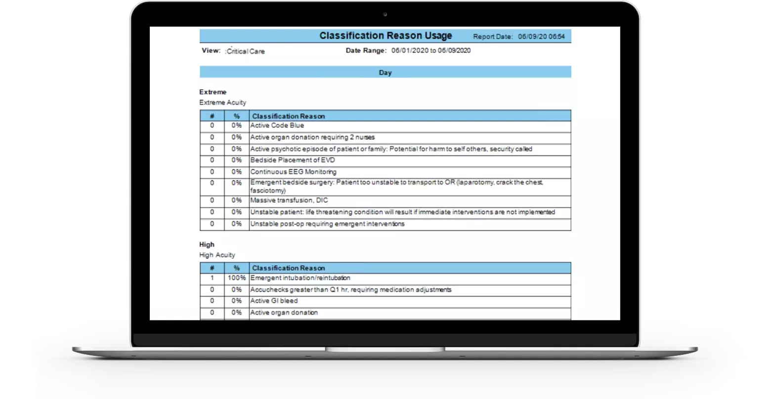
The Classification Reason Usage Report lists all the guideline rationales for a given workload level and how often they have been selected during a given period. This allows you to see the most popular reasons clinicians have been using when adjusting a patient’s workload and determine whether these changes are an accurate representation of the unit’s patient needs. The data captured here can be used to show whether information utilized in the EMR needs to be reevaluated or workload thresholds need to be adjusted.
Most systems are set up just to capture the high and extreme levels, but some organizations have opted to record any changes made to any level.
Patient Classification Detail Report

Whereas the Classification Reconciliation Report gives an overview of the most commonly used reasons for adjusting patient workload — great for trending purposes — the Patient Classification Detail Report allows you to drill down even further by looking at the actual patient whose workload was changed. This report can be run for the length of a patient’s stay so you can see the patient’s workload by shift, why it was changed, and who cared for that patient. The report also shows patient length of stay, which is useful for determining whether certain patient types stay longer than others, and why.
Unit Workload Report
Unit Workload isn’t just the patients themselves. It is also the movement of those patients (the admissions, discharges, and transfers) and your throughput, or churn.

The Unit Workload Report captures a unit’s turnover — giving you visibility into when census is highest during the day in the summary grid and listing when the unit has the most admissions, discharges, or transfers in or out. This enables leaders to better quantify the overall care provided. Depending on how granular you need it to be, this report can be run by day, by shift, by sub shift, or, my personal favorite, by hour.
The Kronos Workforce Scheduler Extensions solution is a valuable tool that gives end-users the ability to efficiently record staff assignments based on patient need and to share data for real-time decision making and retrospective analysis. This information allows leaders to ensure they have the right resources in the right place at the right time — all the time!
I hope this overview of Kronos Workforce Extensions reports has been valuable and will help you get the most out of your solution! Stay tuned for the next post in the series, when we will show you how Kronos Workforce Extensions reports can help you get a handle on your organization’s budget and productivity metrics!